【css】imgやvideoをアスペクト比を保ちつつ画面一杯に表示する
はじめに
機会ないかもしれないけど次やるときのためのメモ。
やりたいのはスマホでこんな感じの画面。画像でも動画でも同じcssで。
横画像
portrait 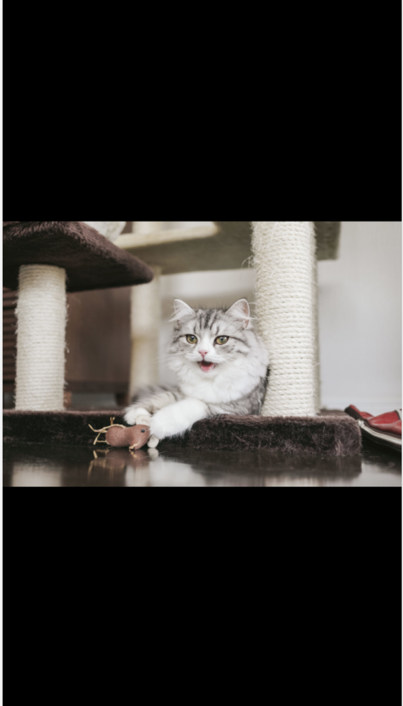 |
landscape 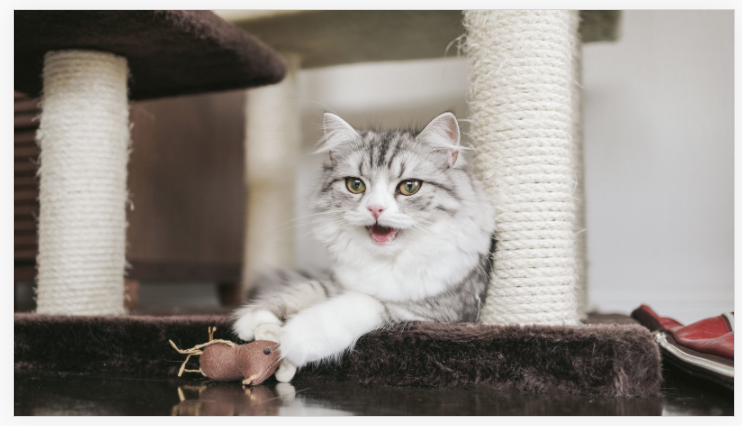 |
縦画像
portrait 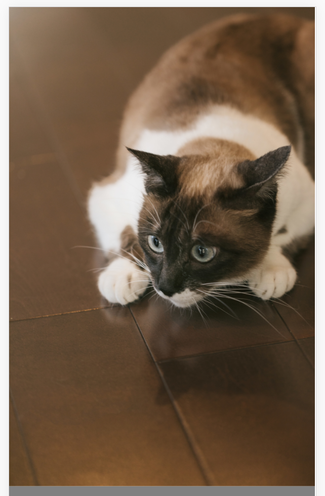 |
landscape 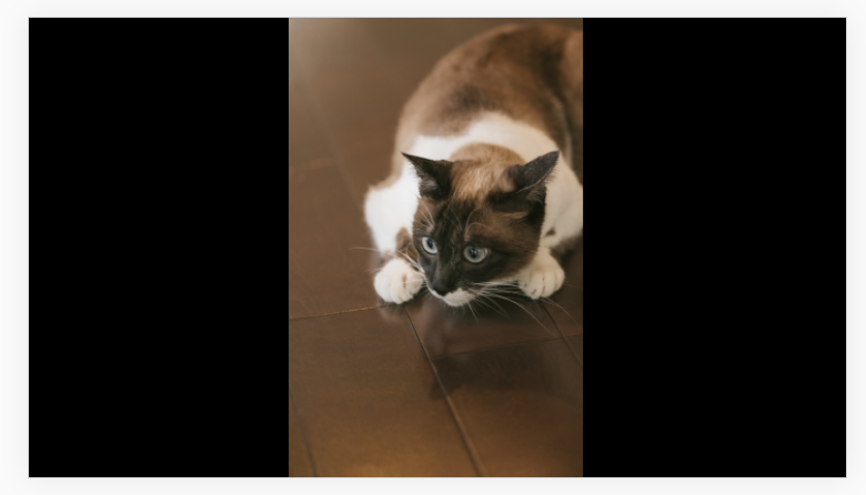 |
実装
htmlはどちらの動画も共通で、cssは横長と縦長とでそれぞれ用意する。
html
<div id="wrapper">
  <img src="/path/to/file" />
</div>
320x180(横長)のcss
body {
  margin:0;
}

#wrapper {
  position:relative;
  width: 100%;
  height:100%;
  background-color:black;
}

#wrapper > img {
  width: 100%;
  position: absolute;
  top: 0;
  bottom: 0;
  left: 0;
  right: 0;
  margin: auto;
}400x625(縦長)のcss
body {
  margin:0;
}

#wrapper {
  height: 100%;
  text-align:center;
  background-color:black;
}

#wrapper > * {
  height: 100%;
}
以上です